Wednesday, 29 October 2008

Almost completed in 2D

Since my post yesterday I have been continuing the development of my mapping process, so as to finish this 2D version and reach the final stage of converting this back to a physical 3D form. Over the last day I have taken the photos of my cast (shown previously) and edited these so that they can be placed back onto the collage to create a final physical (the cast exists in a real physical form) map of the picnic environment. I have now completed this process of placing the images as the resultant layer looks like this:


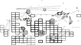
I am very pleased with this image as it gives a sense of the 3D physical form that I was trying to achieve rather than simply the flat 2D approach of lines and pictures. This adds depth to the mapping and allows the interaction of the gestures to come across. This together with the other notations I have done creates images like these:


This creates a really dynamic map of the picnic environment which is readable and interesting to look at. The final part that is missing however is the last notation for hard and soft areas of the collage. I have not completed this yet as I am trying to find a notation that fits well with the current notations. I have come up with one idea which I have tested but I am not sure whether this has the impact and individuality I am trying to achieve, alike to my other notations. This attempt is as follows:


Alike to the light/dark issues I had with my notation, with this notation I feel that it doesn't portray the information very obviously and so it is difficult for the viewer to understand what it is displaying. I feel that this is because, again like the light/dark, there are too many variations, as the size and shape of the objects change as well as how curved they are. This draws attention away from the real difference between the curves and so makes it harder to read. To combat this problem I intend to research into possible ways of measuring and notating hard and soft areas, as well as trying to develop different ways of using the above idea which may be more effective.

Tuesday, 28 October 2008

My cast and more

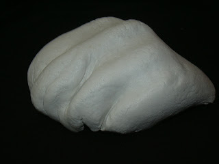
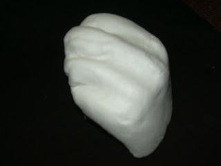
At the beginning of last week I moulded by cast/model for my Picnic mapping project. I chose to mould my hand/knuckles as I felt this would be an interesting and recognisable shape, as well as fitting in well with the collage that I have been putting together. Today I have taken the images of this cast on a black background to begin to place the image onto the collage. Some examples of the images I took are:


When taking these photos I tried to ensure that I had angles of the mould that would match those show in my collage, so that I would be able to easily overlay the collage with the photos to reconstruct the event.
My collage itself has also been developed since my last post as I was not entirely happy with the way I had tried to map the light of the environment and so I have developed another way to notate it, so that each notation is more definable. I have also since added a notation for the load/quiet notation. These are as follows:
Light and Dark

I got this idea for a grid whilst looking for different drawing options in Illustrator. In the line tool there is a grid tool, and I questioned whether I could use this in some way for one of my notations. I then combined this with the original version of the light/dark notation to create a grid that demonstrated the different shades of the image. However when I first did this I used a whole grid like this:

However when I placed this with the other notations, it seemed to me that the differences between squares were harder to see and so it did not make it easy for the viewer to understand what was being represented where. It then occurred to me that the least thick squares, which represented the lightest areas, could just be left out as they represent an abscence of shadow and so rather than representing light and dark, I could focus more on the existence of one or the other. Therefore I removed the areas of the grid that were for the light areas, and left those that represented shadier areas. This left me with the image previously shown, which I believe is a better way of notating the light and dark of the image.
Quiet and Noisy


My inspiration for this was simple. Sound travels outwards from a source as a vibration in the air, and is often represented as a number of curves moving outward from the source. Also the louder the sound the farther it will travel and so the more curves it would make. This led me to the above notation. I chose to use circles rather than simply using curves as I felt that these would stand out better as an individual notation once all of the notations were put together.

With these two new layers placed with the other notations this image is created:


I feel that this is a much more interesting image that is easier to read and more dynamic, and so I am much happier with this version than the previous one. The next step of this process is to complete the notations by drawing one for soft/hard and then by placing the hand images onto the collage as a final physical notation.

Sunday, 26 October 2008

Further Developments

Since I last made a post on this blog I have made a sizable amount of progress in terms of my system drawing. This post is to show you the different ideas have had and how I am planning to continue. Firstly after finally finding a way to access photoshop I produced the following collage image:
This image was developed from the publisher image shown previously, and was built to focus on the various movements made by the participants, specifically focusing on their hands as this is the area I have chosen to study. This meant overlaying certain images to show multiple movements at the same time. Once I was happy that this was a coherent image that displayed everything I wanted, I moved onto the mapping of certain elements of the picnic, using Illustrator. I started by trying to develop a number of different ways that I could use lines to communicate my ideas. This is shown below:


I then tried to attach each of the mapping ideas to one of these ideas and then apply that to the collage of the picnic. The results so far are as follows:


Key:


Light and Dark


Fast and Slow movement


Time (Order of time taken)


All


Without the collage this mapped and image as follows:


Light and Dark


Fast and Slow Movement


Time (Order taken)


All

However after viewing all of the maps together I realised that having the two line notations makes it difficult to identify which lines refer to which form of notation. If I remove the light notation however the image makes more sense. Also the light notation is awkward to understand as it suggests that the different lines of the same thickness mean something different which they don't. Without this notation my mapping looks like this:


Therefore I think I will rebuild the light layer and notate it somehow different. I also still have to notate the image with something for quiet/noisy, and hard/soft. This will be demonstrated in my next post.

Saturday, 18 October 2008

Collation of Photos

After looking through all the photos I had taken I selected ones that I would be able to put together to form an image from my view point of the picnic. The first finished version of this image is shown below:

However this image still makes it quite difficult to fully appreciate the scene so I intend to improve it in order to make it more coherent and understandable. This will also help with the mapping that I will do as the points I choose for the mapping will be more defined and specific than they would be using this picture.

Friday, 17 October 2008

Picnic Photos

Last Wednesday we carried out the start of our Picnic exercise by having a picnic on Mount Edgecombe and taking photos of interactions and behaviours we found interesting. I chose to focus mainly on people's gestures with their hands as this was the most expressive part of their behaviour that could be mapped. After the picnic I looked back on the photos and selected the more relevant ones for me to use as part of the collaged picture I had to make. Below are a few examples of the photos that I took:


First IDAT 106 blog

Heya,
You have entered my IDAT106 blog. This is where I log the important developments of my IDAT106 module Workspaces 1 as part of my Digital Art and Technology course. This blog starts off with the Picnic exercise that I am currently working on and will develop into other tasks as I go through the course. Hope this blog is informative of my thought processes and developments of my project. Enjoy,
Becky Veater