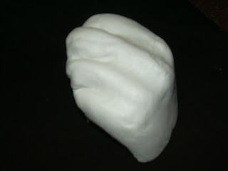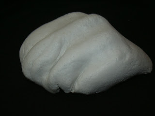

When taking these photos I tried to ensure that I had angles of the mould that would match those show in my collage, so that I would be able to easily overlay the collage with the photos to reconstruct the event.
My collage itself has also been developed since my last post as I was not entirely happy with the way I had tried to map the light of the environment and so I have developed another way to notate it, so that each notation is more definable. I have also since added a notation for the load/quiet notation. These are as follows:
Light and Dark
I got this idea for a grid whilst looking for different drawing options in Illustrator. In the line tool there is a grid tool, and I questioned whether I could use this in some way for one of my notations. I then combined this with the original version of the light/dark notation to create a grid that demonstrated the different shades of the image. However when I first did this I used a whole grid like this:
However when I placed this with the other notations, it seemed to me that the differences between squares were harder to see and so it did not make it easy for the viewer to understand what was being represented where. It then occurred to me that the least thick squares, which represented the lightest areas, could just be left out as they represent an abscence of shadow and so rather than representing light and dark, I could focus more on the existence of one or the other. Therefore I removed the areas of the grid that were for the light areas, and left those that represented shadier areas. This left me with the image previously shown, which I believe is a better way of notating the light and dark of the image.
Quiet and Noisy
My inspiration for this was simple. Sound travels outwards from a source as a vibration in the air, and is often represented as a number of curves moving outward from the source. Also the louder the sound the farther it will travel and so the more curves it would make. This led me to the above notation. I chose to use circles rather than simply using curves as I felt that these would stand out better as an individual notation once all of the notations were put together.
With these two new layers placed with the other notations this image is created:
I feel that this is a much more interesting image that is easier to read and more dynamic, and so I am much happier with this version than the previous one. The next step of this process is to complete the notations by drawing one for soft/hard and then by placing the hand images onto the collage as a final physical notation.


No comments:
Post a Comment