
(http://sofia.usgs.gov/publications/reports/rali/images/10mapx.jpg)
However I do not want to use colour in my notations as this is a less abstract way of displaying the information and may also make my notations unbalanced, as a colour notation may stand out more than the other black line notations I have used and so would draw the viewers attention away from the other information that is provided. The next step I decided to take was to re-define my search so that it was based around density. This is because the density of an object establishes whether an object is hard or soft and so by using this as a measure hard and soft areas could be defined. I therefore started to research into ways of graphically representing density and found this image:

(http://www.optimaldesign.com/AMHelp/Images/density.jpg)
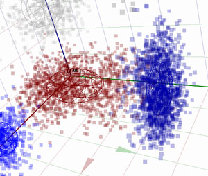
This is a 3D density graph of a cluster of genes. This may not be directly linked to the density of which I refer, but I did feel that this was an interesting image, and also a logical way of displaying density - by replicating the scenario using dots which resembles the particles of the object. I decided to use this idea to notate the hard and soft areas of my collage and so went back to my image and added this final notation:
Key

Notation with image

Notation alone

I am quite happy with this notation as it is easy to understand and deduce information from. This therefore completes my notations. Check my next post for a final overview of what has been created.
No comments:
Post a Comment