Wednesday, 17 December 2008

GPS Path Photos

As previously mentioned after conducting my GPS track the next stage of this project is to document the path by taking photos of the route that was taken. This then leads onto the narrative part of the project. To document my track I chose to take pictures of the path and then lay them onto the path. To then define the route taken slightly better due to the overlap of the images I overlaid the images with an outline of the track. The image that was produced is shown below:To see this documentation more clearly please click on the image. Below is a version of the image without the track line to give a more general view of the area where my track was taken:
The next stage of development of this project is to produce a narrative that maps the path that I made.

Tuesday, 16 December 2008

Paper model of the Picnic (eventually)

After a rather long period of time, I have finally managed to design, mould and photograph the A3 3D model of the notations that I did as the first project of this module. This post is to display the final result, therefore finally completing that project of the module. I decided to mould the model so that the peaks and troughs of the model defined the areas where the largest and least number of different notations appeared. This was often therefore mainly the areas where people in the picnic were sitting as they incorporate both the static elements(hard/soft, light/dark) and the more dynamic elements(sound/movement). The images that I took of the model were taken of both sides of the paper, allowing the model to be show with and without notations. This therefore means the meaning of the peaks and troughs of the model change depending on which side you are viewing. On the notations side the highest points of the model show the areas with the most different notations, and the lowest points show the areas of least number of notations. Therefore this swaps on the non-notational side. The images I took are shown below:


This can be difficult to read and is much more obvious in physical form, but does provide an interesting representation of the data and places it back into the 3D environment in which the original event occurred. This therefore concludes the Picnic section of this module. The only other possible part to add is that of all the Picnic group's models tied together to make a Picnic mat from all of our perspectives. This however is dependant on the others in my picnic group completing their models.

Wednesday, 10 December 2008

Flat GPS Track

When I inserted the GPS track I created in the previous post I used a Google Map to place it on to define that path that was taken round the university. However this image is slightly inaccurate due to the angle at which the sattelite images are taken. Therefore this post is to display another image which displays the GPS track as it is without any inaccuracy. This image is as follows:


According to the orientation of my image in relation to the globe, this is an upside down representation of my track. However when put the right way up you get the follwong image. I have also added a path as before to highlight the image I was creating:


My next post will be the documentation of this track and then the narrative which will map the track in some way after that.

Friday, 5 December 2008

GPS Drawing

In the last couple of weeks of IDAT 106 the focus of the work has been creating GPS drawings. We were told to design an image that could be drawn using GPS within the space of the university and then go out and map it using GPS devices. To design my image I printed off a map of the university from above, and tried to find a path using the paths around the uni that would draw an image. Eventually I decided on a design as follows:


This design shows the letters GPS written out with the pen that drew it following. I decided to use this as it was possible to draw using the paths around the university and also it was relevant to the work that we were doing.
I then tracked this using GPS and got the following result:


This is slightly difficult to see as lines, but with the original design overlayed on top it is more easy to see how the result relates to the image.
I am happy with this GPS image and so will keep it to use with my hertzian space diagram and also the images and narrative which will be produced in the next fews weeks.

Tuesday, 25 November 2008

Roland Levinsky Mapping

Since last week I have obtained the Blue tooth data of the Roland Levinsky Building as I explained in my last post and have then mapped it out accordingly. The map I produced is as follows:

This map displays all the Blue tooth devices found, relating to which floors they were available on. I chose to focus on this element of the data as it was quite interesting how some devices were available only on one floor while others were multi-floored. However it was difficult to tell from the data which ones stretched over how many floors and so I incorporated this into my map of the building to create a better visual representation by which the data could be more easily understood. The image has a key as well as showing the floor numbers down the side as this enabled the data to be split up more precisely and to be grouped with devices that showed similar characteristics.

The next step in this project is to start to use GPS to map environments more accurately.

Tuesday, 18 November 2008

Hertzian Space

Last week we were asked to map the hertzian space of an area as the start of a project into Hertzian space for IDAT106. For this task I decided to map the wifi networks in Alexandra Works, the student accomodation which we are staying in. I chose this as I have a wifi network in my room, and I was intrigued to find out how many other people had decided to do the same as me, especially being that sharing networks is disallowed in the building. I therefore downloaded some stumbler software and took my laptop around the building with a floor plan for each floor to find all the wireless networks and log what I found. The results of this were quite surprising as I found at least 30 networks in the building which only has around 45 cluster flats, meaning that almost every cluster flat has at least one wifi network within it. Below is the list I accumulated from this and then the prototype map I made from the data I could use:


When producing the prototype map on paper for this I chose to use circles to resemble the edge of the area which the network could be reached within. The networks themselves are not shaped in an exact circle, due to the effect of walls and other objects which cut through the space, but I decided that, theoretically, without those obstacles the network should be basically cirular. This also enabled me to map the networks as their distorted shape would be very difficult to define with the technology I have available. I also layered all of the floors on top of each other so that the networks were seen from a birds eye view.
Once I had drawn this, I decided I would translate the prototype to a 3D image so that the idea of a spherical boundary within which a network is available could be more easily portrayed. This image I colour coded similar to that of the 2D map above to demonstrate their relation. Below is this image from 4 different angles in this order (front, back, left, right):


I then showed this to my IDAT106 tutor who suggested that in its current state the 3D map was difficult to understand and read as there was no information explaining what was what and where within the space. I may have been able to understand the image because I knew the space but no one else did and so better communication of the image was needed. I therefore drew up the following image to help solve this:

I could also have chosen to place the floor plan of the space onto this image in relation to the wifi spheres to give a better understanding of the layout, but the angles needed for this would make the image more difficult to read and so I stuck with just displaying where the levels were for each floor in relation to the networks.

The next step for this project is to use GPS to further investigate the hertzian space of the chosen area. I am therefore going to re-do this project in order to make this more accessible for me as the location I have chosen is 20 minutes away from my lectures and so I feel it would be quite difficult to do the GPS mapping efficiently. I am instead going to do another map of the Bluetooth that can be found in the Roland Levinsky building of the university. When I begun this project I had an interest in studying Bluetooth but instead tried to go for something more obscure. By doing the project again in the Roland Levinsky building with Bluetooth, it will make the GPS part of the project more achieveable whilst developing my knowledge further of the hertzian space.

Sunday, 2 November 2008

Final Notations

As I have now completed all of my notations, this post is to show the final completed version of my map of the Picnic with all five notations - time, movement, quiet/noise, hard/soft and dark/light plus the sculpture notation of the hand cast that I made:


I am happy with this overall outcome as it is very dynamic and readable image. The next and final step for this project is to print this image onto A3 paper without the collage background and then work the paper into a 3D surface according to the notations which I have used. By doing this I will be turning something that I have converted into 2D (the Picnic) back into something that is 3D therefore partially returning it to to its original state but in a different form to that which it begun. This could be defined as the Picnic mat to the original Picnic, as the mat is where all the above observations are made, and this final A3 version of my notations will in some ways mimic this scenario. The only aspect missing to make these notations match the Picnic scenario that originally occurred is the aspect of time. Time passed during the original picnic, but this image is static through time and so does not replicate the environment fully.

Hard and Soft is Complete!

Over the last few days I have been researching different ways to illustrate hard and soft to give me inspiration for my own notation of hard and soft in my collage. A lot of the notations I found to begin with were using colour to demonstrate hard and soft surfaces, such as this one:


(http://sofia.usgs.gov/publications/reports/rali/images/10mapx.jpg)


However I do not want to use colour in my notations as this is a less abstract way of displaying the information and may also make my notations unbalanced, as a colour notation may stand out more than the other black line notations I have used and so would draw the viewers attention away from the other information that is provided. The next step I decided to take was to re-define my search so that it was based around density. This is because the density of an object establishes whether an object is hard or soft and so by using this as a measure hard and soft areas could be defined. I therefore started to research into ways of graphically representing density and found this image:


(http://www.optimaldesign.com/AMHelp/Images/density.jpg)


This is a 3D density graph of a cluster of genes. This may not be directly linked to the density of which I refer, but I did feel that this was an interesting image, and also a logical way of displaying density - by replicating the scenario using dots which resembles the particles of the object. I decided to use this idea to notate the hard and soft areas of my collage and so went back to my image and added this final notation:

Key


Notation with image

Notation alone


I am quite happy with this notation as it is easy to understand and deduce information from. This therefore completes my notations. Check my next post for a final overview of what has been created.

Wednesday, 29 October 2008

Almost completed in 2D

Since my post yesterday I have been continuing the development of my mapping process, so as to finish this 2D version and reach the final stage of converting this back to a physical 3D form. Over the last day I have taken the photos of my cast (shown previously) and edited these so that they can be placed back onto the collage to create a final physical (the cast exists in a real physical form) map of the picnic environment. I have now completed this process of placing the images as the resultant layer looks like this:


I am very pleased with this image as it gives a sense of the 3D physical form that I was trying to achieve rather than simply the flat 2D approach of lines and pictures. This adds depth to the mapping and allows the interaction of the gestures to come across. This together with the other notations I have done creates images like these:


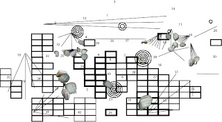
This creates a really dynamic map of the picnic environment which is readable and interesting to look at. The final part that is missing however is the last notation for hard and soft areas of the collage. I have not completed this yet as I am trying to find a notation that fits well with the current notations. I have come up with one idea which I have tested but I am not sure whether this has the impact and individuality I am trying to achieve, alike to my other notations. This attempt is as follows:


Alike to the light/dark issues I had with my notation, with this notation I feel that it doesn't portray the information very obviously and so it is difficult for the viewer to understand what it is displaying. I feel that this is because, again like the light/dark, there are too many variations, as the size and shape of the objects change as well as how curved they are. This draws attention away from the real difference between the curves and so makes it harder to read. To combat this problem I intend to research into possible ways of measuring and notating hard and soft areas, as well as trying to develop different ways of using the above idea which may be more effective.

Tuesday, 28 October 2008

My cast and more

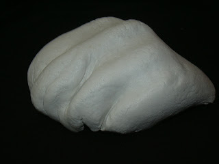
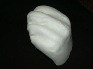
At the beginning of last week I moulded by cast/model for my Picnic mapping project. I chose to mould my hand/knuckles as I felt this would be an interesting and recognisable shape, as well as fitting in well with the collage that I have been putting together. Today I have taken the images of this cast on a black background to begin to place the image onto the collage. Some examples of the images I took are:


When taking these photos I tried to ensure that I had angles of the mould that would match those show in my collage, so that I would be able to easily overlay the collage with the photos to reconstruct the event.
My collage itself has also been developed since my last post as I was not entirely happy with the way I had tried to map the light of the environment and so I have developed another way to notate it, so that each notation is more definable. I have also since added a notation for the load/quiet notation. These are as follows:
Light and Dark

I got this idea for a grid whilst looking for different drawing options in Illustrator. In the line tool there is a grid tool, and I questioned whether I could use this in some way for one of my notations. I then combined this with the original version of the light/dark notation to create a grid that demonstrated the different shades of the image. However when I first did this I used a whole grid like this:

However when I placed this with the other notations, it seemed to me that the differences between squares were harder to see and so it did not make it easy for the viewer to understand what was being represented where. It then occurred to me that the least thick squares, which represented the lightest areas, could just be left out as they represent an abscence of shadow and so rather than representing light and dark, I could focus more on the existence of one or the other. Therefore I removed the areas of the grid that were for the light areas, and left those that represented shadier areas. This left me with the image previously shown, which I believe is a better way of notating the light and dark of the image.
Quiet and Noisy


My inspiration for this was simple. Sound travels outwards from a source as a vibration in the air, and is often represented as a number of curves moving outward from the source. Also the louder the sound the farther it will travel and so the more curves it would make. This led me to the above notation. I chose to use circles rather than simply using curves as I felt that these would stand out better as an individual notation once all of the notations were put together.

With these two new layers placed with the other notations this image is created:


I feel that this is a much more interesting image that is easier to read and more dynamic, and so I am much happier with this version than the previous one. The next step of this process is to complete the notations by drawing one for soft/hard and then by placing the hand images onto the collage as a final physical notation.